 I have been up-to-my-eyeballs recently in executive dashboard metrics and strategy presentations and have come to a startling realization: no one uses pie charts. At least in my experience, everyone wants some trend data or reference, so a pie chart just doesn't cut it.
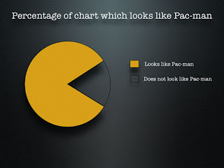
Then, I ran across this great resource called the Periodic Table of Visualization Methods which shows the options for displaying data, information, concepts, strategies, or metaphors. So many options besides the ever-popular line chart. I love it that each of the options includes a pop-up that shows an example of the visualization method. Enjoy! For those of you who like pie charts, here is one that will definitely make you smile:


