Showing posts with label Design. Show all posts
Jennifer B. Davis
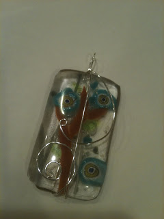
Over this holiday week, I had a chance to do something really fun: fused glass jewelry art. We started at a glass studio (thanks, Teresa!) and ended up at home working with my very talented sister, Rebecca Hull, to finish off the designs. These feature the motifs that are common in my doodles.

This first one uses transluscent glass with bits of colored glass (amusingly called "frit") and some copper wire that oxidized into a rich deep purple color. It was Becca's idea (surprise, surprise) to put two mounts on the pendant. Very interesting!


The second looked like a tree with graphic flowers and leaves before it fused, but afterwards it looked very "under the sea" with crackled glass elements catching the light and little bubbles under the glass. Becca finished it off with curly-cue wire - just my style!


I have stacks-and-stacks of cartoons to post, but until I get them scanned, I can post doodles around my neck!
Jennifer B. Davis
"I base my fashion taste on what doesn't itch."
- Gilda Radner

When my sister was little, she was (and still is) a beautiful girl. Long, curly hair. Cute-as-a-button face. But would the girl wear frilly dresses? No way. They itched.

When I read this quote from Ms. Radner (a hilarious comic by any measure) I thought about those days. Her wanting to wear denim overalls while my mom was trying to get her into a pretty dress.

This was before the days of the tagless tag (an invention that my toddler sister would have cheered for). Before they made fabrics softer and clothing more seamless. Those inventions were there, right in front of us, the whole time. But we didn't see them. We didn't recognize the pain for what it was...a design problem to be solved. Once we identified it and named it, I am sure we could have solved it. My Mom is a great seamstress and our family is full of artists and problem-solvers, so I am sure we would have invented the tagless shirt, lined children's clothes, or the adaptation of swimsuit fabric to children's dresses. The problem had not been named, so it couldn't be solved.

What problems are you facing today that are like that? Moderate annoyances or hinderances that keep things from being truly useful, truly beautiful, or truly comfortable. Observe it. Name it. Then go about solving it. This is how we save the world, one itch at a time.
Jennifer B. Davis
I read Seth Godin's new book Tribes. In it, he makes some very provocative points about the fallacy of quality.

"Quality is not only not necessary, for amny items it's undesirable. If we
define quality as regularly meeting the measured specifications for an item,
then quality matters a lot for something like a pacemaker. It doesn't
matter at all for a $3,000 haute couture dress.

More fashion = less need for quality."


I found this statement very interesting. If something is more fashionable, it doesn't have to be "six sigma." More art. Less science.

I wonder if there isn't a graph that would show that people's expectation of quality rises as commoditization takes over a product. It becomes less unique. Less differentiated. And as a result, the marketplace raises the standards of "sameness." Predictability is favored over excellence. The restaurant franchise wins out over the brilliant chef. The factory pumping out millions of widgets wins out over the inventor.

Seth's point, and one that he doesn't advocate alone, is that quality is something the "factories" used to value, but that in many ways we have evolved beyond it. With the use of technology. With a growing discontent for sameness. We are demanding leadership and sometimes (or ALL the time) leadership is messy.

Makes me wonder how much we as leaders of companies, organizations, families, and product lines should emphasize quality, in its traditional definition. Maybe more effort needs to be put into true differentiation and a value that extends beyond predictable mediocrity.
Jennifer B. Davis
This is right up my alley. Designers who create concepts that no one ever buys can put them up for sale in an online marketplace at IncSpring. As a buyer you can search brands by industry, color, or name. You can see how others have rated the logo before you buy.

This might be a great way for a design student to get some of their work out there and get some clients using their designs.

I think it is interesting what business ideas themselves can come from these logos. For instance, the gift-wrapped roll of toilet paper and the company name "PrankExpress" bring to mind all sorts of funny gifts and things that could be sold and marketed.

I know this is opposite of how the "experts" say to do branding and identity design. They say you need to analyze your business, your corporate culture, your value proposition, and your customer perceptions before encoding them into a logo (and brand name). While I don't necessarily disagree, I wonder if a business (especially a start-up or small business) couldn't come pretty darn close by shopping for a logo that appeals to them and a few of their customers they might show it to. Research done. Logo designed. Now, they can go out and grow their business.
Jennifer B. Davis
Sometimes you see products or ideas and immediately think "Brilliant! Why didn't I think of that?" Here are a few that I think are great.


In the land of the Dutch, where bicycles reign, a new company is combining bike racks with hand pumps for tires. Springwise pointed it out and you can learn more at http://www.heklucht.nl/. I love when convenience and user experience are combined with common materials to deliver a new thing. Somehow this reminds me of a former colleague who installed a beer keg in his garage and punched through the adjoining wall, so that he could tap beer right from his recliner in front of the TV (okay, maybe that is exactly opposite of a bike rack).


If you have ever juggled silverware and your plate at a potluck, then you'll love snap-and-dine. All the pieces are joined together to create a sturdy surface for the buffet line. The only thing they need to add is a glass and a napkin. This one was from CoolHunting.

The final submission is not a product, but rather a crowd-sourced service of sorts. When we were choosing names for our children I found a very useful site where strangers had gone to the trouble to rate and comment on names, ranking them according to perceived attractiveness, intelligence, athleticism, and other criteria that might come back to haunt the kids later. I found it very insightful and I really valued getting the feedback early before we made a mistake. Now, you can get strangers to provide your image consulting in much the same way. Your very own focus group. Sadly, the site and service are only in German, but what an opportunity for someone in the States to do something similar (or to utilize their high school German). Check it out at checkyourimage.com.


Jennifer B. Davis
I won't even try to add commentary to the things that Smashing Magazine put together in a post called "10 Beautiful Things for a Beautiful Life." Check it out!
Jennifer B. Davis
I have to admit I am a PowerPoint junkie. At work we use it ALL THE TIME and sometimes we forget that we can have meetings without it. I just learned about a new tool that might change all of that, it is called SlideRocket.

What I love about it already is that it is web-based, it appears to create beautiful and innovative presentations, and has built-in tools for presentation sharing over the web. No need to utilize PowerPoint AND a web conferencing tool in the future. Plus, they have some community elements that look interesting.

If you really need/want to use PowerPoint, you can always export your SlideRocket show. If you must.
Jennifer B. Davis
I regularly follow the blog posts from 37Signals. They recently posted notes from the Chicago-area SEED 3 conference and I must admit they are the best conference notes I have ever seen. The artist/notetaker is Mike Rohde. Some fantastic nuggets in there even for folks like us who didn't attend.

You might think of inviting Mike, or someone like him, to your next conference, sales meeting, your next board presentation, or perhaps your next church worship service. Could be a whole new experience!
Jennifer B. Davis
Just saw a write-up on Posterous, a super simple blogging platform. I thought Tumblr was the simple one, but this platform is even easier. It takes the information in the header of an email and turns it into an authentication for a blog post. Pretty ingenius (perhaps not without its risks as well).

Check it out and think about how you can take unnecessary human steps out of your product or service. It might be easier than you think!
Jennifer B. Davis
I just received a great little article by Patrick Lencioni, an author who I highly recommend. You can sign up for their newsletter here. It was about the design of office spaces and how it affects employee interaction.

"The biggest problem with traditional office space is what it suggests about the importance of individual versus collective work. By placing greater emphasis on privacy than openness and collaboration, companies unconsciously encourage people to see their work as being primarily individual. Whether we‘re talking about line employees in cubicles or senior executives in walled offices, workers are almost trained to seek out greater separation and space."

What is your favorite work environment? Private in an office, yards or time zones away from your colleagues? In an open environment for collaboration?

About a year ago I worked on a full-scale office redo and I found it very inspiring to visit some office showrooms. I loved Herman Miller, whose innovation is award-winning. They had these great "bee-hive" designed cubes with 120-degree angles (instead of the traditional square 90-degree cubes). If you are interested in this sort of thing, I'd definitely recommend you taking a field trip to a local showroom or checking out their research white papers.


Jennifer B. Davis
Simplicity is the name of the game now-a-days. The new Evite alternative called Mobaganda takes that a step further. Without having to register, you can create an invite, email it to people and track their responses via RSS feed. The design is ugly (my personal opinion, I am sure), but the concept is cool. It is build on the Google Application Engine, in case you care about those kind of things.

I learned about it several weeks about on Twitter (@stirman is the person behind the launch). To keep tabs on cool things like this you can follow me at www.twitter.com/jenniferdavis.
Jennifer B. Davis
Love this memo from scrapbook artist, Ali Edwards. Click on the image to see her blog.


Jennifer B. Davis
As close to mind-reading as I have seen, I used presdo the other day to arrange for a meeting and it worked pretty slick. I like the streamlined interface where you just type in what you want to do in words and it helps you fill in the blanks.

Furthermore, I like how the developer (a co-founder of LinkedIn) bootstrapped the development on his own money. I am feeling an affinity with enterpreneurs of this type currently and hope it is wildly successful.
Jennifer B. Davis


"I like an escalator because an escalator can never break, it can only become stairs. There would never be an escalator temporarily out of order sign, only an escalator temporarily stairs. Sorry for the convenience." - Mitch Hedberg

We once built an incredibly useful web application at work to handle a business problem that was labor intensive, a critical differentiator for our business, and was something that we needed to scale. The application was slick and worked really well, at least I thought. Then we started getting new users to try it and as they learned the nuances, we found they needed some "Do you really want to send this?" or "Do you really want to delete this?" confirmations added in to prevent some errors. In addition, logic needed to be added to the site that would prevent incorrect data from being entered in the first place. One colleague described the early version of the application as a gun without a safety. Powerful, but a big dangerous in the wrong or inexperienced hands. We quickly identified the risk areas and put fixed in place, but not without causing some consternation first. I have found that there are at least 3 ways to error-proof your product.

1. Make the Error Impossible

Usability experts like to focus on making the "right" thing to do obvious. I believe, however that equal attention needs to be played to making the "wrong" thing impossible (or at least horribly difficult). The shaped solid ink cartridges in a Xerox color printer is a great example of this. You can't put them in the wrong slots. They don't fit. All products and applications should be error-proofed in this way. Some people check for email formats on entry fields or check sum credit card numbers to ensure they were typed correctly. What about making sure in other ways that people can not proc

2. Take the Pain out of Error States

For a higher standard still, you can look to the quote above about escalators. How can you make a disabled, broken, or improperly used product still functional, but just not as functional. Instead of a 404 error on a website, what about sending users to an alternative page with a training video or with the offending part of the code pre-selected with defaults to make it easier for the user? Maybe in addition to sewing extra buttons into shirts, they should include safety pins. If the people mover at the San Francisco airport is not in operation, people can still walk on it and get a bounce in their step and view the artwork and displays on the wall. Remember, too that delays are error states and entertaining customers while they wait is also a way to take the pain away.

3. Reframe Unavoidable "Errors" as Opportunities for Differentiation

Taken one step further still, what about taking the unavoidable (or frequent) errors and turning them into differentiation points. For instance, all products eventually reach the end of their useful life (the ultimate error state). What about providing real solutions for empty packaging, used products, or those products which are at the end of their useful life? I firmly believe more people should bundle in recycling/removal or upgrade programs into the costs of their product. What other errors are unavoidable or frequent enough to justify looking at them differently? If most people mistakenly hit some key, select an inconvenient option, or have problems with particular types of installations, why not develop programs around those things and turn them into features that are marketed as differentiators, rather than error states to be avoided?

Jennifer B. Davis
Following the recommendation of a colleage and an unability to get an appointment with our normal primary care physician, we went to ZoomCare this weekend. If you are in Portland I highly recommend you check out their services. In any case, their approach illustrated 10 ways that innovators can change industries. I really hope my dentist, my hairdresser, and other service businesses I frequent are reading this.

1. Let your customers buy/schedule online
Go to http://www.zoomcare.com/ and pick your appointment time. So simple. Again, why can't I schedule a hair appointment like this? We scheduled my husband's appointment after hours and it was confirmed via email (our choice) by the next morning. The doctor had read the comments that we had put on our appointment request prior to the appointment.

2. Let customers be spontaneous
Their website includes a real-time graphic indicator of the wait time in their two offices. This is handy for estimating how an impromptu appointment will affect your day. There is no wait if you have an appointment, but if you don't, you can see how busy the place is without leaving your house.

3. Seize a niche
ZoomCare is in the gap between urgent care centers and traditional doctor's offices. You don't get to pick your doctor. They don't treat heart attacks, strokes, offer kidney dialysis, or deliver babies. They are a healthcare solution for folks that are generally healthy, but need periodic treatment.

4. Publish a price list
It is crazy to think that ZoomCare's website might be the first fee schedule I have ever seen in healthcare. Normally, insured patients don't even know what their healthcare is costing them (besides their co-pay and then the statement that they receive showing what the insurance has paid). This doesn't lead to good consumer behavior. It is fee schedules like ZoomCare that make me think that I could accept one of those catastrophy-only healthcare plans, where I'd pay out of pocket (but before tax) for office visits, etc. The fees didn't seem too bad and even if all of us came into the office each month, the fees would be less than I am paying in insurance today (and my employer pays most of it, so I am only seeing a portion of the actual cost).

5. Don't underhire your front-line staff
ZoomCare hires front-desk staff that have college degrees and diverse backgrounds. Where other doctors offices have clerks, these guys are more like cruise directors. I suspect the hiring managers would love their office associates had experience in a circus, speaking multiple languages, and had degrees in diverse fields. After all, they are the face of the company and should be a reason people come back. The doctor was great, too!

6. Treat your customers like intelligent, rational human beings
My husband was shown in his diagnosis by the doctor (with the use of a video screen). Then the front desk person walked him through the treatment handout at the desk and had a bag of information ready for him when he left.

7. Partner seamlessly
Zoomcare accepted our insurance (it was listed on their website as one of the plans they accepted). They emailed (or appeared to email) the prescription to the pharmacy of our choice. My doctor's office by contrast, made me call into their separate prescription line and I had to provide the phone number and address of the Costco pharmacy that I wanted them to use, something they could have Googled as well as I could.

8. Don't partner when you can provide
The office itself had a whole little store front set up where they sold over the counter treatments and other items that their customers might need. It reminded me of the little stores set up in hotel lobbies for those who forgot their toothpaste. If the patient needed aspirin and some cough drops, they could get them right there and avoid yet another stop along the way.

9. Don't underestimate the power of a happy customer
We were told at Zoomcare by someone (who was impressed by the follow-up phone call he received to ensure he was feeling better). We have gone on to tell no fewer than 12 people (and that was before this blog post) about the service.

10. Make your customers beg for more
We already wish they had an office closer to us (it was worth the drive, but could be more convenient). The ZoomCare brand could certainly expand to a whole range of health services. I wish they had dentists/hygenists on staff (although my dentist's office practices would make them a great candidate for running a ZoomCare Dental office). They could expand to vision care. They could expand to an online over-the-counter medication store with home delivery. They could expand to home health care of other types. The positive brand they have built can expand out to new endeavors. Perhaps ZoomCare will expand to a neighborhood near you!
Jennifer B. Davis
This has to be one of the coolest custom products ever, custom metal cufflinks from Eleven Forty Design. They are individually modeled from a picture (or you can pick from your favorite person from their portfolio which includes Einstein and Flash Gordon). Each sleeve would have one side. Put them together and they create a little portrait bust. Imagine your toddler, your dog, or your favorite superhero immortalized on your cuffs.

This would be an interesting category of products for a custom engraver (or laser "tattoo" artist) to have. Send in a picture and they engrave it onto a flat silver cufflink. Probably would be a lot cheaper than this sculpted design, but just as personal.
Jennifer B. Davis
Oxford Landing wine out of South Australia makes it easier for customers to become repeat buyers of their products. Their labels include a tear-off card to remember the wine by. I rememer in the days of the Rolodex (now, there is a company that missed the boat...they had the brand that could have lead them to create Act! or Plaxo, but that is another post), marketing literature would often include a die-cut Rolodex card that people could tear off and save. This is the wine bottle equivalent. Brilliant!

I think product packaging is one of the most underutilized mediums for viral marketing. I'd love to hear about other examples that you have seen.
Jennifer B. Davis
I am a list maker and an organizer type. You know...the kind you ask to plan things and handle things because I can keep my wits about me and manage tons of details. However, I have learned that there is a barrier to organization that many can never overcome...the front-end work and clarvoyance required. Before you know all the stuff that needs to be done, you must start a list. You must organize your day without knowing what emergency may arise. You must create a filing system before you know all the things that you may want to file. And, before you have anything to file, you must create your plan.


Now, you can see why I love and fear for the success of a new product from BlueLounge called the Space Station. It is a sleek desk organizer with "internal coiling pins" to maintain the sprawl of wires that exist on most desks. The design has a "why didn't I think of it" simplicity and I am thinking variations of this could be made out of a wood for a more furniture feel (which is what I would want for my home office).

Still, we'd all have to designate these USB ports, decide what equipment would need to be accessed frequently enough to get a cord wrap, go out and buy duplicate connections for when you traveled (assuming this puppy doesn't fold in the middle to fit in a carry-on bag), and the other things that kept people's desk messy in the first place. I wish them luck!
Jennifer B. Davis
The lengths that people will go for self-expression (and to brag about their accomplishments) is extreme, for sure. So, it should be no surprise that people are using the Internet to share their fashion sense or their home decorating. Beyond self-expression, this might be a great way for designers to keep their finger of the pulse of emerging trends and for the rest of us to get bite-sized inspiration from normal people around the world.

For some examples, check out Normal Room to see self-published pictures of home decor. See a group photo pool on Flickr called Wardrobe Remix.
Jennifer B. Davis
Usually, people complain when their rooms are too cold, but not visitors to Sweden's ICEHOTEL. Here they take temperature to an extreme and make it a dominant feature of the hotel.

The hotel is built entirely out of a ice, down to the plates and glasses. I have friends who have been. I have friends who want to go and have brainstormed how to make an ice glass for their Pepsi just to mimic the experience.

I, for one, hate being cold. It would be incredible to see, but I don't think I would even think about staying there. Brrr....

I wonder if there is any other feature of a hotel (rather than the dirty bedspread and the broken ice machine in the hall) upon which hoteliers might differentiate a destination hotel. What if every room had a walk-in mini-bar appropriate for entertaining? What if the room service menu included take-out from 30 area restaurants? What if the bathrooms were larger than the sleeping rooms and included Japanese soaking tubs, a steam shower, and an extensive collection of aromatherapy lotions and bubble bath? Hmmm...